Introduction to Data Analysis using the Star Wars Dataset
 Photo by Vexod14 on Deviant Art
Welcome to the exciting world of data analysis! In this first blog post, we embark on data exploration and insights, leveraging the iconic Star Wars universe as our dataset. Whether you are a seasoned data enthusiast or a curious beginner, join me on this adventure to uncover patterns, trends, and fascinating correlations within the Star Wars universe.
Why Star Wars?
The Star Wars saga has captured the hearts and minds of millions across the globe, creating a rich tapestry of characters, planets, and events. Leveraging a dataset originally from the R programming language allows us to merge the captivating narratives of Star Wars with the power of statistical analysis. By delving into the data, we aim to gain deeper insights into the dynamics of this beloved universe and explore questions that pique our curiosity.
What to Expect
Throughout this series, I will guide you through the fundamentals of data analysis using Python and some statistical computing and graphics libraries. I will cover essential concepts such as data cleaning, exploration, visualization, and interpretation, all within the context of the Star Wars dataset.
Whether you are interested in uncovering the most popular characters, exploring relationships between different planets, or analyzing trends across the original trilogy versus the prequels, this series will equip you with the skills to derive meaningful insights from data.
Prerequisites
Do not worry if you are new to data analysis; I will start from the basics. However, having a basic understanding of Python and a passion for Star Wars will undoubtedly enhance your experience.
Getting Started
The Star Wars database is originally embedded within the dplyr package of the R programming language. I have facilitated its accessibility by exporting it as a CSV file called starwars.csv, enabling us to conduct exploratory data analysis using Python and a diverse array of libraries.
In this data analysis, I employ the pandas library for efficient data manipulation and exploration and the ydata_profiling library to generate insightful data profiles. Upon executing the provided code, I use pandas to read the Star Wars dataset as a data frame named starwars_df and create a summary of its structure by using the info() method.
# Import the data analysis libraries.
import pandas as pd
from IPython.display import IFrame, display
from ydata_profiling import ProfileReport

# Read the Star Wars dataset.
starwars_df = pd.read_csv("starwars.csv")
display(starwars_df.info())
<class 'pandas.core.frame.DataFrame'>
RangeIndex: 87 entries, 0 to 86
Data columns (total 14 columns):
 #   Column      Non-Null Count  Dtype
---  ------      --------------  -----
 0   name        87 non-null     object
 1   height      81 non-null     float64
 2   mass        59 non-null     float64
 3   hair_color  82 non-null     object
 4   skin_color  87 non-null     object
 5   eye_color   87 non-null     object
 6   birth_year  43 non-null     float64
 7   sex         83 non-null     object
 8   gender      83 non-null     object
 9   homeworld   77 non-null     object
 10  species     83 non-null     object
 11  films       87 non-null     object
 12  vehicles    11 non-null     object
 13  starships   20 non-null     object
dtypes: float64(3), object(11)
memory usage: 9.6+ KB
Upon loading the dataset, we can examine the data frame’s size, column names, data types, and the count of observations. In brief, the Star Wars dataset comprises 87 observations and 14 variables, namely:
- name: The name of the character (
uniquevalues); - height: The height of the character in centimeters (
cm); - mass: The mass or weight of the character in kilograms (
kg); - hair_color: The color of the character’s hair (i.e.,
11classes); - skin_color: The color of the character’s skin (i.e.,
31classes); - eye_color: The color of the character’s eyes (i.e.,
15classes); - birth_year: The birth year of the character in
BBY(Before Battle of Yavin) orABY(After Battle of Yavin) (i.e., in range of[896 BBY~29 ABY); - sex: The gender of the character (i.e.,
female,male,hermaphroditic, andnone); - gender: Another indicator of the character’s gender (i.e,
feminineandmasculine); - homeworld: The planet of origin or home planet of the character (i.e.,
48classes); - species: The species to which the character belongs (i.e.,
37classes); - films: The films in which the character appears (i.e.,
24classes); - vehicles: The vehicles associated with the character (i.e.,
10classes); and - starships: The starships associated with the character (i.e.,
15classes).
Subsequently, I used the ydata_profiling library to generate a detailed report of the Star Wars dataset, emphasizing textual insights and exploratory data analysis for a comprehensive overview of the dataset.
# Generating the dataset report.
profile = ProfileReport(starwars_df, explorative=True)
profile.to_file("starwars.html")
IFrame("starwars.html", width="100%", height=750)
Data Cleaning
Upon generating the report using the ydata_profiling library, I observed missing values in 10 of 14 variables (20.4% of data cells). To ensure data accuracy, I meticulously cross-referenced all values in the dataset with information from Wookieepedia — an online Star Wars encyclopedia — validating and enhancing the integrity of our analysis.
I identified certain inconsistencies between the Star Wars dataset and the data available on Wookieepedia, indicating potential disparities in the information. Data on Wookieepedia features two distinct sections: Canon and Legends. The Canon section contains official Star Wars material that is part of the official narrative and storytelling established by Lucasfilm. This includes the primary saga films, TV series, novels, and other media that form the cohesive and recognized Star Wars lore.
On the other hand, the Legends section contains content from the Star Wars Expanded Universe (EU) that is no longer considered part of the official Canon. This content includes stories, characters, and events before Lucasfilm’s redefinition of the Canon in 2014. Although some of these narratives differ from the current official storyline, fans appreciate them as a significant component of Star Wars history within the broader Star Wars mythos.
The Star Wars dataset often predominantly features data from the Legends section, e.g., Luke Skywalker’s weight (77 KG) shown in the following image: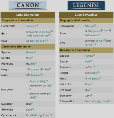
Legends section. I identified several inconsistencies between the dataset and Wookieepedia, notably in characters and events. For example:
I converted float values to integer values in the
birth_yearandmassvariables, e.g., Darth Vader and Anakin Skywalker’s birth year was41.9and Boba Fett’s mass was78.2.I unified the color names such as
blondinstead ofblonde, and the American Englishgrayinstead of the British Englishgrey. I chose only the first one when the Wookieepedia had different hair colors.I updated the characters’ names to the ones presented in the Wookieepedia description, namely:
Leia Organa Solo,IG-88B,Bossk'wassak'Cradossk,Gial Ackbar,Wicket Wystri Warrick,Shmi Skywalker Lars,Aayla Secura,Ratts Tyerell,Rey Skywalker, andBB-8.I filled out some missing data in the Star Wars dataset (marked as
NA) when the information was available on Wookieepedia description.I corrected the wrong data in the Star Wars dataset compared to the data available in the
Legendssection of Wookieepedia.
During my exploratory research on Wookieepedia, I made the decision to enrich the Star Wars dataset by incorporating additional information about the characters. This is the new summary of updated Star Wars dataset available on updated_starwars.csv:
# Read the updated Star Wars dataset.
updated_starwars_df = pd.read_csv("updated_starwars.csv")
display(updated_starwars_df.info())
<class 'pandas.core.frame.DataFrame'>
RangeIndex: 87 entries, 0 to 86
Data columns (total 25 columns):
 #   Column       Non-Null Count  Dtype
---  ------       --------------  -----
 0   name         87 non-null     object
 1   height       86 non-null     float64
 2   mass         65 non-null     float64
 3   hair_color   82 non-null     object
 4   skin_color   86 non-null     object
 5   eye_color    87 non-null     object
 6   birth_year   50 non-null     float64
 7   birth_era    50 non-null     object
 8   birth_place  37 non-null     object
 9   death_year   62 non-null     float64
 10  death_era    62 non-null     object
 11  death_place  57 non-null     object
 12  sex          87 non-null     object
 13  gender       87 non-null     object
 14  pronoun      87 non-null     object
 15  homeworld    83 non-null     object
 16  species      87 non-null     object
 17  occupation   87 non-null     object
 18  cybernetics  7 non-null      object
 19  abilities    55 non-null     object
 20  equipment    62 non-null     object
 21  films        87 non-null     object
 22  vehicles     15 non-null     object
 23  starships    20 non-null     object
 24  photo        87 non-null     object
dtypes: float64(4), object(21)
memory usage: 17.1+ KB
After the data cleaning, the Star Wars dataset comprises 87 observations and 25 variables. These are the descriptions of the new variables:
- birth_era: The calendar era during which the character was born (i.e.,
BBYandABY). - birth_place: The place where the character was born.
- death_year: The year in which the character passed away.
- death_era: The calendar era during which the character died (i.e.,
BBYandABY). - death_place: The place where the character died.
- pronoun: The pronoun associated with the character (i.e.,
she/herandhe/his). - occupation: The most relevant occupation of the character in the Star Wars saga.
- cybernetics: Any cybernetic enhancements or implants the character possesses.
- abilities: Special power, abilities or skills of the character.
- equipment: The equipment or items carried by the character.
- photo: A reference to a photo or image of the character.
Therefore, I used ydata_profiling library to generated a new report of the updated Star Wars dataset.
# Re-generating the dataset report.
profile = ProfileReport(updated_starwars_df, explorative=True)
profile.to_file("updated_starwars.html")
IFrame("updated_starwars.html", width="100%", height=750)
Exploratory Data Analysis
Inspired by the insights from ydata_profiling reports, I will guide you through the fascinating realm of exploratory data analysis in the updated Star Wars dataset. Together, we will delve into the power of Python and visualization libraries such as Matplotlib, Wordcloud, and Seaborn to unlock the visual narratives hidden within the data.
Word Cloud
In data visualization, a Word Cloud (or Tag Cloud) is a gorgeous graphical representation where words are visually emphasized based on frequency. In our Star Wars dataset, I have chosen the variable occupation as the focal point for this Word Cloud, aiming to unveil the most prevalent roles within the galaxy far, far away.
I will take a strategic approach to generate our Word Cloud by splitting the character occupations into individual words. This meticulous step ensures that each distinct role is appropriately represented in the visualization, providing a nuanced and comprehensive glimpse into the diverse professional landscape within the Star Wars universe.
To generate this insightful plot using Python, particularly leveraging the power of the WordCloud library, I will start by importing the necessary libraries. Using the character occupations from our dataset, I will craft a compelling visualization that visually highlights the occupations that dominate the Star Wars universe.
# Import the data visualization libraries.
%matplotlib inline
import matplotlib.pyplot as plt
from collections import Counter
from wordcloud import WordCloud

# Assuming "occupations" is our string.
occupations = " ".join(updated_starwars_df.occupation.str.lower())

# Split the string into words.
words = occupations.split()

# Create a Counter dictionary with the number of occurrences of each word.
word_counts = Counter(words)

# Create a wordcloud from words and frequencies.
wordcloud = WordCloud(
    background_color="white", random_state=123, width=300, height=200, scale=5
).generate_from_frequencies(word_counts)

# Display the generated word cloud.
plt.imshow(wordcloud, interpolation="bilinear")
plt.axis("off")
plt.show()
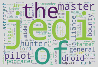
In our initial exploration of character occupations, the top three most frequently revealed words by the Word Cloud are jedi (20 occurrences), of (19 occurrences), and the (15 occurrences). Strikingly similar to the patterns observed in ydata_profiling reports, this alignment underscores the consistency between the automated insights and our manual exploration.
To refine this analysis, I will strategically remove common prepositions like of and the from the words dictionary. This step aims to enhance the Word Cloud’s precision by focusing on the substantive and unique aspects of character occupations, providing a more precise representation of the diverse roles within the Star Wars universe.
# List of prepositions.
prepositions = [ "of", "the", "in", "to", "for" ]

# Remove the prepositions.
words = [word for word in words if word not in prepositions]

# Join the words back into a string.
text = " ".join(words)

# Create a Counter with the number of occurrences of each word.
word_counts = Counter(words)

# Create a wordcloud from words and frequencies.
wordcloud = WordCloud(
    background_color="white", random_state=123, width=300, height=200, scale=5
).generate_from_frequencies(word_counts)

# Display the generated word cloud.
plt.imshow(wordcloud, interpolation="bilinear")
plt.axis("off")
plt.show()
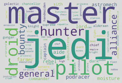
Following refinement, the Word Cloud showcases the most prevalent and distinctive character occupations in the Star Wars saga. The top three words are jedi (20 occurrences), master (12 occurrences), and pilot (9 occurrences). This precision-driven approach has unveiled the core professional roles, emphasizing the significant influence of Jedis, Masters, Pilots, and Droids throughout the Star Wars narrative. In conclusion, the generated Word Cloud is a visually compelling reflection of the saga’s occupational landscape, offering insights into the predominant roles that shape the galaxy’s epic story.
Data Correlation
Embarking on the exploration of data correlation, I will delve into the quantitative aspects of the updated Star Wars dataset. Beginning with a comprehensive analysis of descriptive statistics for the numerical values within the data frame, I aim to find patterns and relationships that shed light on the intricate dynamics of the Star Wars universe.
Descriptive Statistics
I will use the describe() method to generate descriptive statistics that summarize a dataset’s distribution’s central tendency, dispersion, and shape while excluding NaN values.
# Create a subset of the dataset with only the numerical columns.
numerical_data_df = updated_starwars_df.select_dtypes(include="number")
numerical_data_df.describe()
| height | mass | birth_year | death_year | |
|---|---|---|---|---|
| count | 86.000000 | 65.000000 | 50.000000 | 62.000000 |
| mean | 173.616279 | 94.353846 | 78.940000 | 16.370968 |
| std | 36.141281 | 161.754002 | 145.357042 | 11.627037 |
| min | 66.000000 | 15.000000 | 2.000000 | 0.000000 |
| 25% | 167.000000 | 55.000000 | 29.000000 | 4.000000 |
| 50% | 180.000000 | 79.000000 | 47.500000 | 19.000000 |
| 75% | 191.000000 | 84.000000 | 70.750000 | 22.000000 |
| max | 264.000000 | 1358.000000 | 896.000000 | 45.000000 |
Another compelling alternative is to generate histograms, visually representing the distribution of numerical variables. Histograms offer a concise and intuitive way to observe the frequency and pattern of data points, aiding in identifying trends, central tendencies, and potential outliers within the dataset.
# Import the library used to generate the Gaussian curve.
import numpy as np
import scipy.stats as stats

# Create a 2x2 matrix of subplots.
fig, axes = plt.subplots(2, 2, figsize=(10, 8))

# Flatten the axes array for easy iteration.
axes = axes.flatten()

# Iterate over the numerical columns and plot histograms.
for i, col in enumerate(numerical_data_df.columns):

    # Create a histogram subplot.
    ax = axes[i]
    ax.hist(numerical_data_df[col], bins=50, alpha=0.5, color="#3498db",
            edgecolor="black", density=True)

    # Calculate mean and standard deviation.
    mean = numerical_data_df[col].mean()
    std = numerical_data_df[col].std()

    # Generate x values for the Gaussian curve.
    x = np.linspace(
        numerical_data_df[col].min(), numerical_data_df[col].max(), 100
    )

    # Generate the Gaussian curve using the mean and standard deviation.
    y = stats.norm.pdf(x, mean, std)

    # Plot the Gaussian curve.
    ax.plot(x, y, color="red", linewidth=2, label="Gaussian")

    # Plot vertical lines for the mean, and median.
    ax.axvline(
        mean, color="red", linestyle="dashed", linewidth=1.5, label="Mean"
    )
    ax.axvline(
        numerical_data_df[col].median(), color="green", linestyle="dashed",
        linewidth=1.5, label="Median"
    )
    ax.axvline(
        numerical_data_df[col].mode().values[0], color="blue",
        linestyle="dashed", linewidth=1.5, label="Mode"
    )

    # Set the title and legend.
    ax.set_title(col)
    if i == 1:
        ax.legend(loc="upper right")
    if i % 2 == 0:
        ax.set_ylabel("Normalized Density")

# Adjust the spacing between subplots.
plt.tight_layout()

# Display the plot.
plt.show()
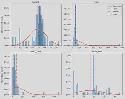
I chose to normalize the histograms (Y-axis) to fit the Gaussian curve as it facilitates a standardized comparison of distributions, allowing for a clearer understanding of the data patterns. Through this normalization, the histograms become comparable on a standardized scale, aiding in identifying trends and deviations.
This normalization process, particularly evident in height, mass, and birth_year histograms, revealed a notable normal distribution, shedding light on inherent patterns within those variables. The histograms highlighted their outliers in the mass and birth_year distributions, providing valuable insights into data points that deviate significantly from the expected norm.
Correlation Matrix
The next step is generating the correlation matrix between quantitative variables. This task is crucial to provide a comprehensive overview of the relationships and dependencies within the dataset. This matrix identifies patterns, strengths, and directions of correlations between variables, offering valuable insights into how different aspects of the data interact. Understanding these correlations is fundamental for making informed decisions during data analysis. It facilitates the identification of key factors influencing the overall dataset.
In the previous step, I identified outliers in the mass and birth_year variables. Therefore, I removed them before generating the correlation matrix.
# Import the library used to generate the correlation matrix.
import seaborn as sns
from scipy.stats import pearsonr

# Remove outliers.
numerical_data_df = numerical_data_df.query(
    "mass < 1000 or mass.isna()"
)
numerical_data_df = numerical_data_df.query(
    "birth_year < 200 or birth_year.isna()"
)

# Define a function to plot the correlation coefficient.
def rcoeff(x: pd.Series, y: pd.Series, **kwargs):

    # Calculate the correlation coefficient without the NaN values.
    nas = np.logical_or(np.isnan(x), np.isnan(y))
    statistic, _ = pearsonr(x[~nas], y[~nas])

    # Plot the correlation coefficient.
    ax = plt.gca()
    ax.annotate("r = {:.2f}".format(statistic), xy=(0.5, 0.5), fontsize=18,
                xycoords="axes fraction", ha="center", va="center")
    ax.set_axis_off()

# Subplot grid for plotting pairwise relationships in a dataset.
g = sns.PairGrid(numerical_data_df)
g.map_diag(sns.histplot)
g.map_lower(sns.regplot, line_kws = {"color": "red"})
g.map_upper(rcoeff)

# Display the plot.
plt.show()
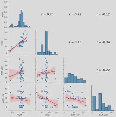
I have implemented the previous Python code inspired by the functionality of the chart.Correlation() method found in the PerformanceAnalytics library in R programming language. This code generates a comprehensive correlation plot showing (i) each variable’s distribution on the diagonal, (ii) scatter plots with fitted lines offer visual insights below the diagonal, and (iii) above the diagonal, the correlation coefficient values calculated using Pearson correlation to provide a brief overview of the relationships between variables. Together, this visualization encapsulates a holistic representation of correlations within the quantitative variables of the dataset.
For a more straightforward approach to generating the correlation matrix, the corr() method within the Pandas DataFrame is a convenient alternative. By leveraging Seaborn’s heatmap() function, we can visually represent the matrix as a plot, offering an intuitive overview of variable relationships. Alternatively, displaying the matrix as a table provides a concise, tabular representation of the correlation coefficients between variables.
# Plot the correlation matrix as a heatmap.
correlation_matrix = numerical_data_df.corr()
plt.figure(figsize=(10, 8))
sns.heatmap(correlation_matrix, annot=True, cmap="RdBu")
plt.title("Correlation Matrix")
plt.show()

# Display the correlation matrix as a table.
correlation_matrix
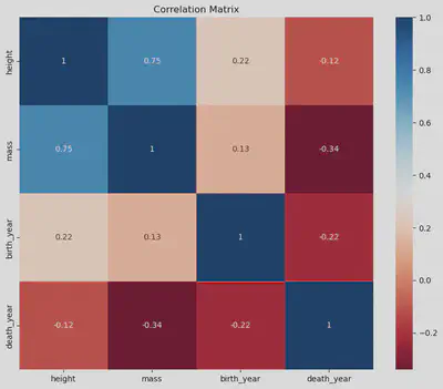
| height | mass | birth_year | death_year | |
|---|---|---|---|---|
| height | 1.000000 | 0.749906 | 0.223612 | -0.119421 |
| mass | 0.749906 | 1.000000 | 0.131401 | -0.340285 |
| birth_year | 0.223612 | 0.131401 | 1.000000 | -0.221817 |
| death_year | -0.119421 | -0.340285 | -0.221817 | 1.000000 |
Linear Regression
I opted for linear regression analysis between the variables height and mass as they exhibited the highest correlation coefficient in the correlation matrix. This choice allows for a closer examination of their linear relationship, providing valuable insights into how height changes correspond to mass changes within the dataset.
I will generate two scatter plots for a comprehensive analysis: the first showing the original updated Star Wars dataset with outliers and the second showing the dataset without outliers and incorporating a linear regression line. Scatter plots prove instrumental in visually examining the relationship between height and mass, offering a clear depiction of individual data points and the potential impact of outliers. This approach facilitates a more nuanced understanding of the variables’ correlation and the effectiveness of the linear regression model in capturing their underlying relationship.
# Create a figure with two subplots.
fig, axes = plt.subplots(1, 2, figsize=(12, 6))

# Plot the scatter plot of updated_starwars_df.
p0 = sns.scatterplot(x="height", y="mass", data=updated_starwars_df, ax=axes[0])
axes[0].set_title("updated_starwars_df")

# Get the maximum value in the mass column and draw it as a red circle.
max_mass = updated_starwars_df["mass"].max()
max_mass_row = \
  updated_starwars_df.loc[updated_starwars_df["mass"] == max_mass].iloc[0]
p0.text(max_mass_row["height"] + 4, max_mass,
        max_mass_row["name"], horizontalalignment="left",
        size="medium", color="black")
p0.plot(max_mass_row["height"], max_mass, "ro")

# Plot the scatter plot with linear regression for numerical_data_df.
sns.regplot(x="height", y="mass", data=numerical_data_df, ax=axes[1],
            line_kws = {"color": "red"})
axes[1].set_title("numerical_data_df")

# Display the plots.
plt.tight_layout()
plt.show()
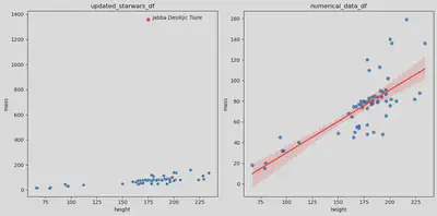
The shaded red area surrounding the linear regression line, plotted using sns.regplot() method, represents a confidence interval — a statistical measure estimating the uncertainty associated with the regression estimate.
More specifically, this 95% confidence interval for the regression line implies that if the data were sampled repeatedly, approximately 95% of the computed regression lines would fall within this red-shaded region.
The width of the confidence interval at any given X-axis point is proportionate to the standard error of the estimated mean of the dependent variable (y) for that particular independent variable (x). The interval widens where predictions are less precise.
In essence, the red-shaded region provides insights into the reliability of the regression line’s predictions: a narrower area signifies a more reliable prediction.
In my analysis’s final stages, I calculated the slope and intercept of the linear regression correlation between height and mass to characterize their relationship quantitatively. This allowed for a precise understanding of the average change in mass associated with each unit increase in height.
# Perform linear regression on numerical_data_df without the NaN values.
x = numerical_data_df["height"]
y = numerical_data_df["mass"]

nas = np.logical_or(np.isnan(x), np.isnan(y))
slope, intercept, r_value, p_value, std_err = stats.linregress(x[~nas], y[~nas])

# Print the slope and intercept.
print("Slope:", slope)
print("Intercept:", intercept)

# Print the correlation coefficients.
print("\nr:", r_value)
print("r^2:", r_value ** 2)

# Print the p-value.
print("\np-value:", p_value)

# Print the standard error.
print("\nStandard error:", std_err)
Slope: 0.6079300655359812
Intercept: -30.746294295916215

r: 0.7499061747801137
r^2: 0.5623592709733424

p-value: 2.3135803923476263e-12

Standard error: 0.06923567550379309
In the context of our statistical analysis, the linear regression reveals a positive correlation between height and mass. The calculated slope of 0.608 suggests that, on average, for each additional centimeter in height, there is an associated increase of approximately 0.608 kilograms in mass. The intercept of -30.746 indicates the estimated mass when height is zero, which is not practically meaningful in this context.
In this statistical analysis, the linear regression between height and mass yields a correlation coefficient r of 0.75, indicating a strong positive correlation. The coefficient of determination r^2 at 0.56 signifies that approximately 56% of the variability in mass can be explained by variations in height. The extremely low p-value (2.31e-12) suggests the statistical significance of the correlation, and the standard error of 0.069 reveals the precision of the regression estimate. With height measured in centimeters and mass in kilograms, these results provide a robust understanding of the quantitative relationship between the two variables.
Download
The foundations for this post and the subsequent statistical data analysis using the Star Wars dataset were built upon the tools and materials encompassing Python programming, Pandas, Seaborn, and Scipy libraries. These resources facilitated a comprehensive dataset exploration, enabling insights into the relationships between variables such as height and mass in the Star Wars universe.
- The original Star Wars dataset exported from R programming language: starwars.csv
- The updated Star Wars dataset with 87 observations and 25 variables: updated_starwars.csv
- The original Jupyter Notebook I have used to write this post: starwars.ipynb
References
These resources provided a solid foundation for understanding and implementing the methodologies discussed in the post.
De Andrade, Nazareno Ferreira. (2023, December 01). Fundamentals of Research in Computer Science 2. Federal University of Campina Grande (UFCG). https://www.youtube.com/playlist?list=PLvvIUEwTZK9wvSEiASWyLXYb2a2KAON-v.
Cauwels, Kiana. (2023, December 12). R… But Make it Star Wars. Kaggle. https://www.kaggle.com/code/kianacauwels/r-but-make-it-star-wars.
Serra, Maria. (2023, December 12). Star Wars Dataset 2022. NovyPro. https://www.novypro.com/project/star-wars-dataset-2022.
Barbry, Chad; and Greenwood, Steven. (2023, December 19). Wookieepedia - The Star Wars Wiki. Fandom. https://starwars.fandom.com/wiki/Main_Page.
Fabricio Batista Narcizo
Part-Time Lecturer
My research interests include eye tracking, human-computer interaction, computer vision, machine learning, and data analysis.